 Ever tried opening your own WordPress site on your phone… and it took forever to load, or the text looked like it was designed for ants? Yeah, that’s your wake-up call to optimise for mobile.
In 2025, more than 70% of website traffic comes from mobile users. Google’s made it clear: if your site isn’t mobile-friendly, you’re not ranking no matter how good your content or backlinks are.
Let’s break this down step-by-step, so by the end of this guide, your WordPress site feels like it was born for mobile.
Why Mobile Optimisation Matters More Than Ever
Here’s the thing Google doesn’t just “prefer” mobile-friendly websites. It demands them.
The reason? Mobile-first indexing. That means Google checks the mobile version of your site first before deciding how to rank it. If your pages look messy or load slow on mobile, your rankings (and visitors) vanish fast.
But it’s not just SEO. Mobile users are impatient. Research shows that if a page takes longer than 3 seconds to load, nearly half of users bounce.
Now imagine your visitors trying to read your blog, pinch-zooming just to find the menu. Frustrating, right? That’s how you lose trust and conversions in seconds.
So yeah, mobile optimisation isn’t optional anymore it’s survival.
Check If Your WordPress Site Is Mobile Friendly
Before fixing anything, let’s see how bad (or good) your site currently is.
Step 1: Use Google’s Mobile-Friendly Test
Head over to Google’s Mobile-Friendly Test
Type your website URL and hit “Test URL.”
If it says “Page is mobile-friendly,” congrats but don’t relax yet. You still need to check performance.
Step 2: Run a Speed Audit
Use tools like:
- PageSpeed Insights (by Google)
- GTmetrix
- Pingdom Tools
You’ll see separate scores for Mobile and Desktop. Focus on the mobile one.
If your mobile score is below 80, you’ve got some work to do and this guide is about to help you fix that.
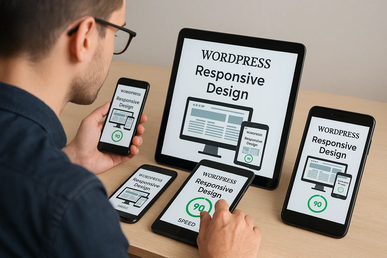
Choose a Responsive Theme That Actually Works
One of the biggest rookie mistakes is using a theme that looks good on desktop but breaks on mobile.
A responsive WordPress theme automatically adapts to any screen whether it’s a 6-inch phone or a 12-inch tablet.
Here’s what to look for when picking one:
- Lightweight and clean code: Avoid bloated multipurpose themes.
- Built with mobile-first design: Prioritise themes made using mobile breakpoints.
- Compatible with popular page builders: Like Elementor or Gutenberg blocks.
Some reliable, fast themes you can trust:
- Astra
- GeneratePress
- Kadence
- Blocksy
- Neve
If you’re already using one but it’s sluggish, switch to a mobile-friendly theme and test again. Sometimes, changing your theme is like losing 2MB of dead weight instantly.
Optimise Images for Mobile Load Speed
Here’s a fact images are usually the heaviest files on any WordPress site. They make your site look great, but they also slow it down if not optimised.
Think of it like this: loading a 2MB image on a phone with 3G feels like waiting for dial-up internet in 2005.
Quick Fixes You Can Do Right Now:
- Resize Before Uploading – Don’t upload 4000px images if your layout only needs 800px.
- Use WebP Format – It’s modern, smaller, and supported by all browsers.
- Install an Image Optimisation Plugin –
- ShortPixel
- Smush
- EWWW Image Optimizer
These plugins compress your images automatically when you upload them.
Pro Tip:
Use a lazy-load feature. It makes images load only when a user scrolls to them. Less data, faster load.
You can activate lazy loading easily using plugins like WP Rocket or LiteSpeed Cache.
Use Caching and CDN Plugins (Without Overdoing It)
Speed equals survival. Mobile users don’t wait.
Caching stores a static version of your site, so it loads instantly instead of regenerating each page for every visitor.
CDN (Content Delivery Network) distributes your content across global servers meaning if someone in Dubai visits your site, they’ll get data from a nearby server, not one sitting in New York.
Best Tools for the Job:
- LiteSpeed Cache (great if your host uses LiteSpeed servers)
- WP Rocket (premium but powerful)
- Cloudflare CDN (free plan is enough for most small blogs)
Setup Tips:
- Don’t stack too many cache plugins. One good one is enough.
- Clear cache whenever you make big changes (like updating themes or CSS).
- Enable “mobile cache” if your plugin has it ensures pages display correctly on all devices.
Clean Up Heavy Plugins and Scripts
If your WordPress dashboard looks like a plugin graveyard, it’s time for spring cleaning.
Every unnecessary plugin adds extra scripts and CSS files, which can slow down mobile loading.
Ask yourself:
- Do I really need this social share plugin that loads five JavaScript files?
- Can I replace multiple small plugins with one multipurpose one?
Audit Tip:
Use Query Monitor or P3 Plugin Profiler to see which plugins slow you down.
Once identified, remove the heavy ones and find lightweight alternatives.
Lightweight Alternatives You’ll Love:
- Instead of Jetpack → Try Slim SEO Tools
- Instead of Contact Form 7 → Use WPForms Lite
- Instead of Revolution Slider → Use Smart Slider 3
Remember, less is faster.
Adjust Font Sizes and Buttons for Touch Screens
Mobile users interact with thumbs, not mouse pointers. So if your buttons are too small or your text too tiny users will leave instantly.
Here’s a mini checklist for perfect mobile UX (User Experience):
| Element | Recommended Size |
|---|---|
| Body Text | 16px–18px |
| Headings | Scalable and consistent |
| Buttons | Minimum 48x48px touch target |
| Line Spacing | At least 1.5x text size |
You can adjust all of these using your WordPress Customiser or your page builder.
Bonus Fix:
Keep paragraphs short 2 to 4 lines max. Mobile readers prefer scrolling, not reading walls of text.
Test Using Google’s Mobile-Friendly Tool
Once you’ve made your optimisations, it’s time for the real test.
Head to Google Search Console or Mobile-Friendly Test again.
Look for:
- No overlapping text or elements
- Fast load time
- Buttons easy to tap
- Responsive images
Also, use Chrome DevTools:
Press Ctrl + Shift + I → Toggle Device Toolbar → Choose any phone (like iPhone 13).
Now preview your site live in different screen sizes fix anything that looks off.
Bonus: Make Mobile SEO a Priority
Even a perfectly designed mobile site can fail if you ignore mobile SEO.
Here’s how to make sure Google loves your mobile pages:
- Responsive meta tags:
Add this in your site’s<head>:
<meta name="viewport" content="width=device-width, initial-scale=1.0"> - Avoid intrusive popups:
Google penalises sites that block content with full-screen popups. - Use AMP (Optional):
Accelerated Mobile Pages (AMP) can improve load speed, but only if done right. Try the AMP for WP plugin if you post a lot of blogs. - Optimise Core Web Vitals:
Focus on:- LCP (Largest Contentful Paint) – under 2.5s
- FID (First Input Delay) – under 100ms
- CLS (Cumulative Layout Shift) – under 0.1
These directly affect mobile rankings in 2025.
- Add schema markup:
Helps Google understand your site better. For example, if you’re a blog, use Article schema. Plugins like Rank Math make it easy.
When to Call It “Good Enough”
Here’s the truth you’ll never make your site perfect. And that’s okay.
Your goal isn’t perfection; it’s balance.
- Fast enough for users to stay.
- Clean enough for Google to rank.
- Smooth enough for you to maintain.
Once your site loads under 3 seconds and looks clean on a mid-range smartphone, you’re already ahead of 80% of websites out there.
Why Are People Moving Away From WordPress (and Why You Shouldn’t)
Some folks say, “WordPress is too heavy for mobile.” That’s not entirely true.
WordPress itself isn’t slow it’s how people use it.
- They stack 40 plugins.
- They install bloated page builders.
- They ignore image sizes.
If you treat WordPress like a sports car and not a storage truck, it’ll run like lightning.
Besides, the flexibility, community, and plugin ecosystem make it unbeatable for anyone who wants full control without coding.
The Future of WordPress Is Mobile-First
WordPress is already moving towards mobile-first site building.
Block-based editing in Gutenberg and Full Site Editing themes are built with mobile users in mind.
And with the rise of AI-driven site builders, mobile design is becoming even more automated but still, the fundamentals remain the same:
- Keep it simple
- Keep it fast
- Keep it readable
If you stick to those three, you’ll always be ahead.
Final Thoughts
Optimising your WordPress site for mobile isn’t just about speed; it’s about respecting your visitors’ time.
They don’t care how pretty your desktop site looks they just want your page to load instantly and look clean on their phone.
So, take the time today to:
- Switch to a responsive theme
- Compress those images
- Clean your plugins
- Test and tweak your layout
And if you need a hand making your content more readable or SEO-ready, use a good Paraphrasing Tool from ParaphrasingTool.com it helps reword your pages for clarity and flow without breaking your SEO.
Once your WordPress site is fast, mobile-ready, and clear visitors won’t just stay longer… they’ll trust you more.
That’s the real power of mobile optimisation.

Alex WebPro, your guide to web mastery. Expert tips on WordPress, SEO, monetization, and the best in design trends and themes.